5 Korean prompts that make your UI look a lot better
Translated by AIView original
When you build websites with AI, you end up saying things like this a lot.
"Make it more modern."
"Make sure it looks good on mobile too."
"Improve accessibility as well."
But requests like these are way too vague about what counts as good.
I recently saw a UI/UX prompt example from Sinda | SKatalyst AI (@SKatalystAI) on X, and the core idea was simple.
Don't just ask the AI for the result. Give it the criteria, the constraints, and how to verify it too.
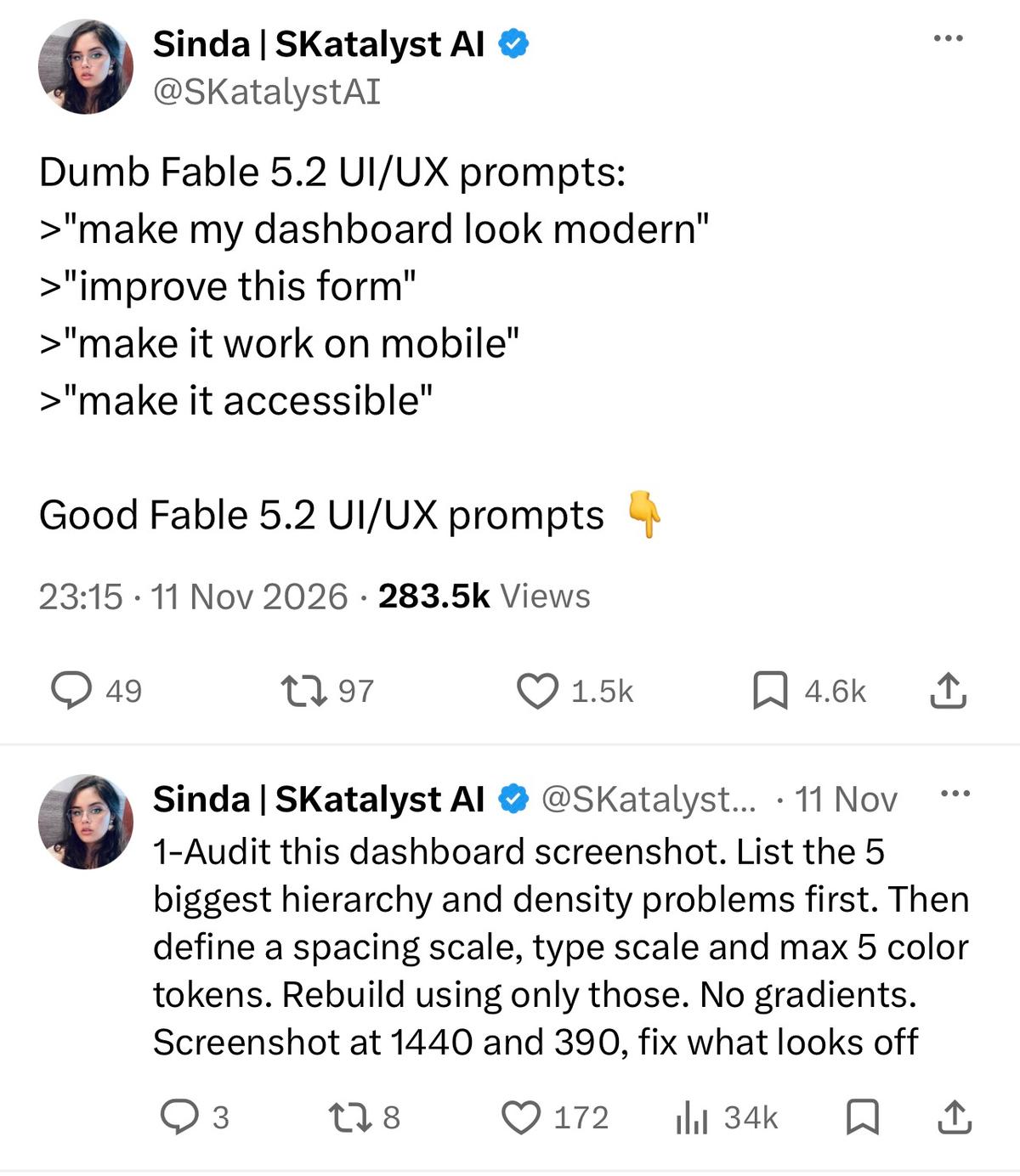
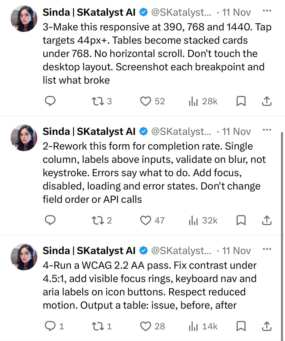
I organized the content of the attached image so you can try it right away in Korean.
1. When the whole UI feels a bit off
현재 화면을 분석해줘.
정보 위계, 여백, 정렬, 밀도 관점에서
가장 큰 문제 5개를 먼저 찾아줘.
그다음
- spacing scale
- type scale
- 최대 5개의 color token
을 정하고 그 규칙 안에서 UI를 다시 정리해줘.
불필요한 그라데이션은 사용하지 마.
1440px 데스크톱과 390px 모바일에서 확인하고,
어색한 부분을 한 번 더 수정해줘.
기존 기능과 데이터 처리 로직은 변경하지 마.
The point is not to have it fix things right away, but to have it go in this order: find the problem → define the rules → fix → verify.
2. When improving an input form
사용자가 폼을 끝까지 작성하기 쉽게 개선해줘.
- 한 줄에 하나의 입력 항목
- label은 input 위에 표시
- 입력 중이 아니라 blur 이후 validation
- 오류 메시지는 해결 방법까지 안내
- focus / disabled / loading / error 상태 추가
기존 필드 순서와 API 호출 방식은 변경하지 마.
When fixing the UI, it's important to set a scope so it doesn't touch existing features too.
Comments 1
Translated by AI·View originals
The "problem found → rule defined → fix → verify" order in prompt #1 is what clicked for me most. I use something similar, but I add one more step: lock down the design tokens first. Otherwise every fix quietly adds new colors and new spacing values, and before long you can't touch anything anymore. Since you asked, here's a prompt I use: "List every color, spacing value, and font size used on the current screen. From now on, don't create new values that aren't on that list. Change it to use the closest existing value instead. Summarize the changed spots with their file paths." Run that once to set a baseline, and then have it do the form improvements for #2 or the polish for #5. The results wobble a lot less. Adding #5 yourself is a nice touch too. Nice work.